A very authentic brandingfor a 100-years old farm.
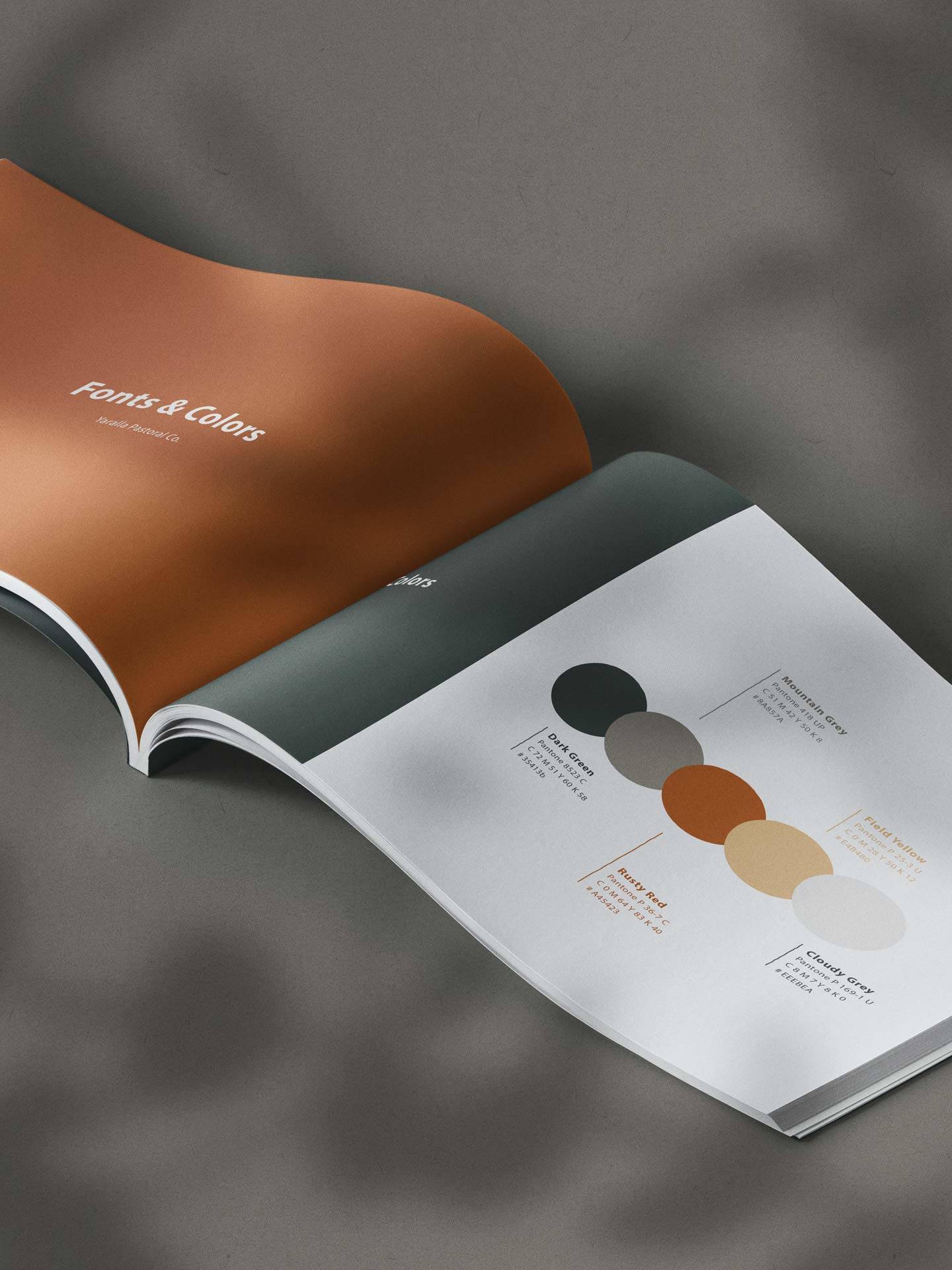
Creating a logo for a farm that started its business 100 years ago, truly is an honor! While being on the farm for three month we got the best insights about their values. We really wanted to integrate the dusty feeling of Western Australia in their branding, so we chose a warm red for the dirt roads, a dark green for the bushland, a stone grey for the mountains and a deep yellow for the grain.
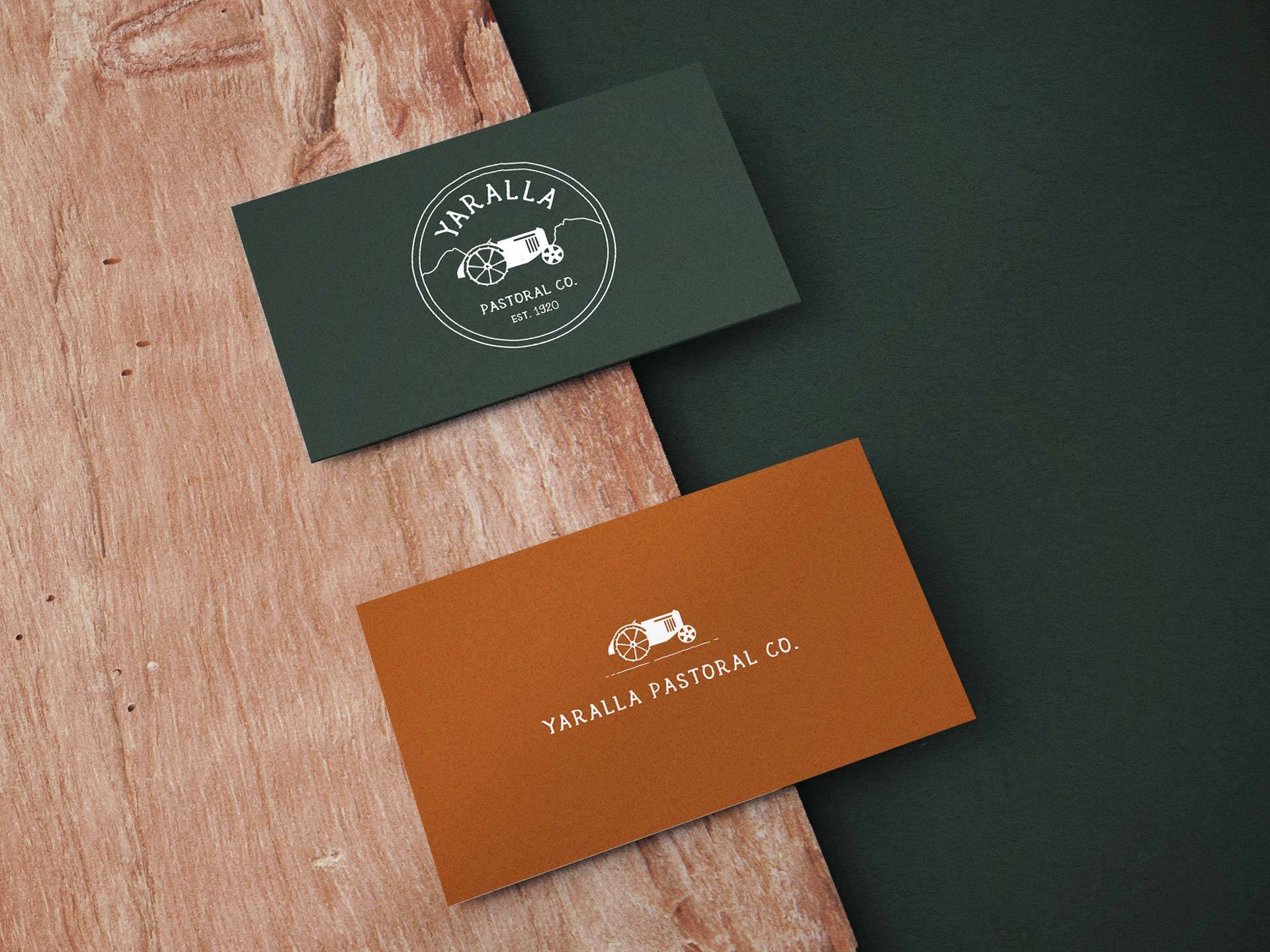
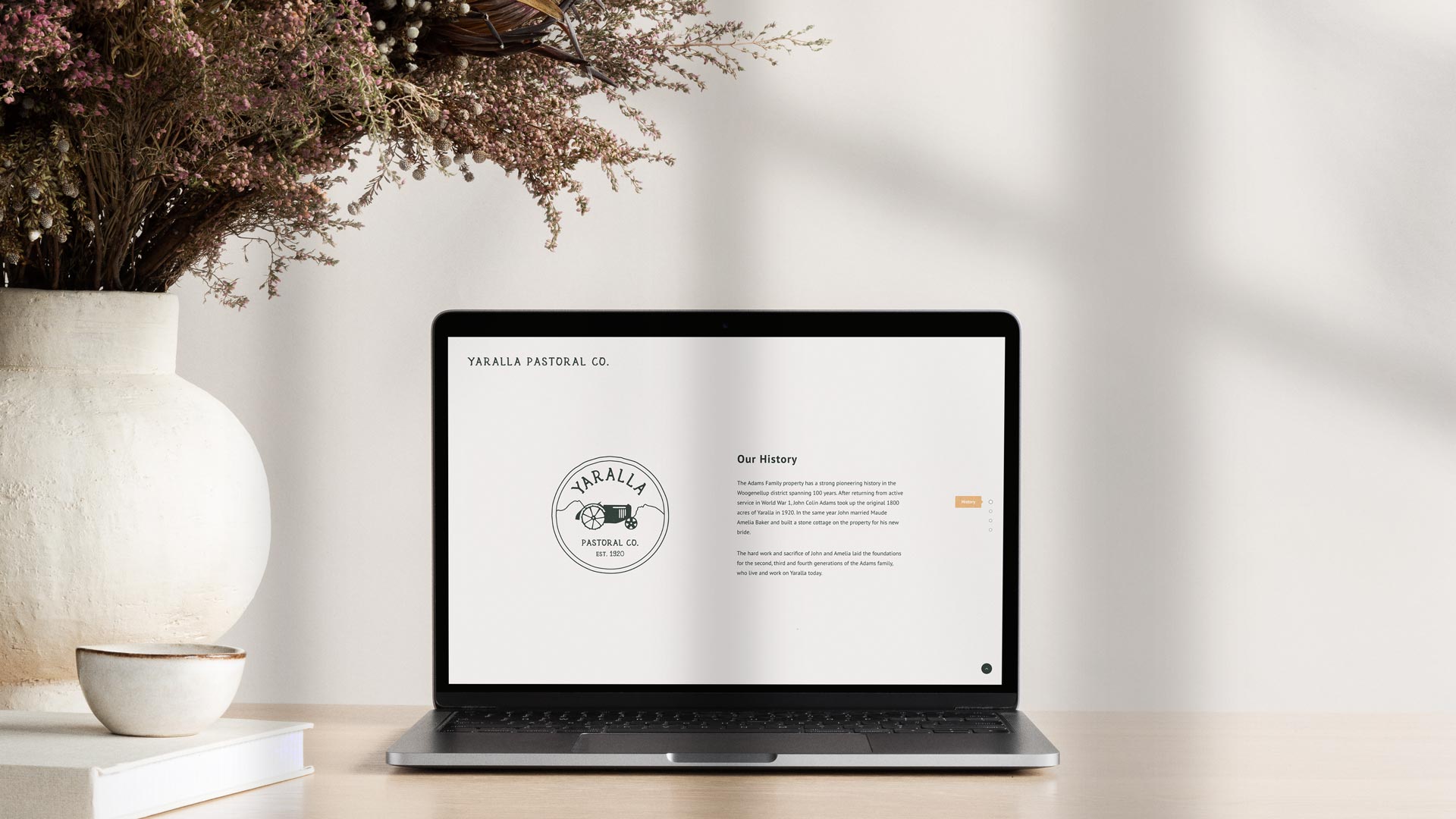
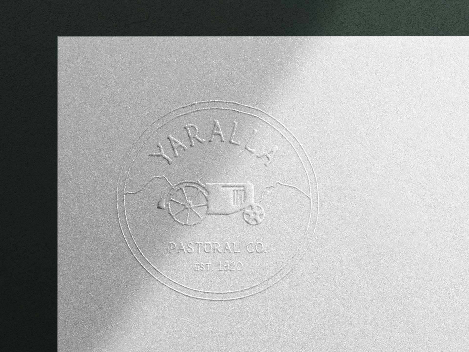
Their logo had to include an illustrative version of their very first tractor, which was operated by the 97-years old farmer back in the olden days. Also, the farm is located right near the Stirling Ranges so we wanted to integrate the beautiful mountain view of ‘Sleeping Beauty.’ We’ve put so much love in this brand and hope their identity will be lived by the next generation for the next 100 years.
SERVICES
Visual Identity, Logo Design, Collateral, Website
CLIENT
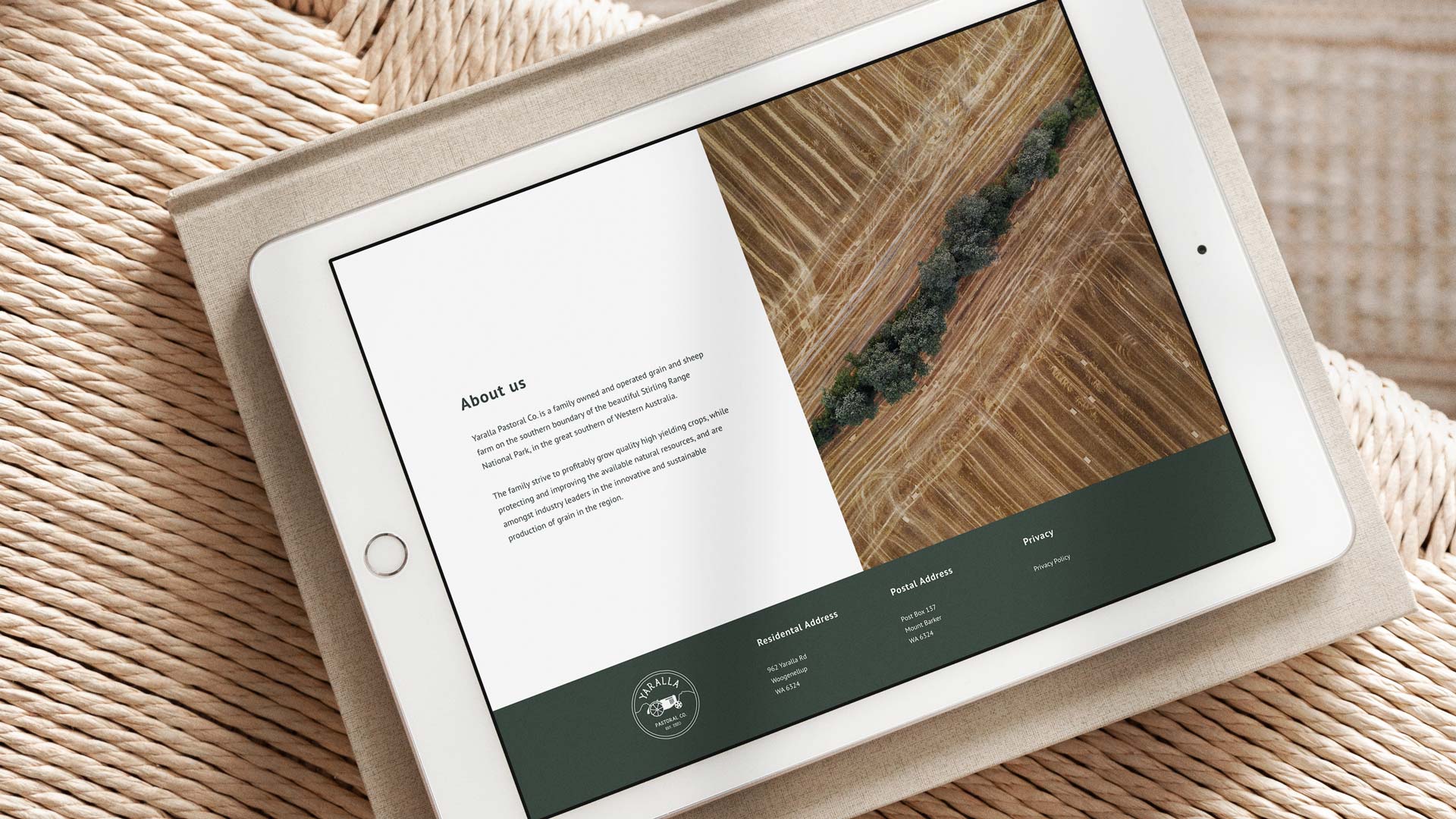
Yaralla Pastoral Co
Western Australia
WEBSITE
SHARE
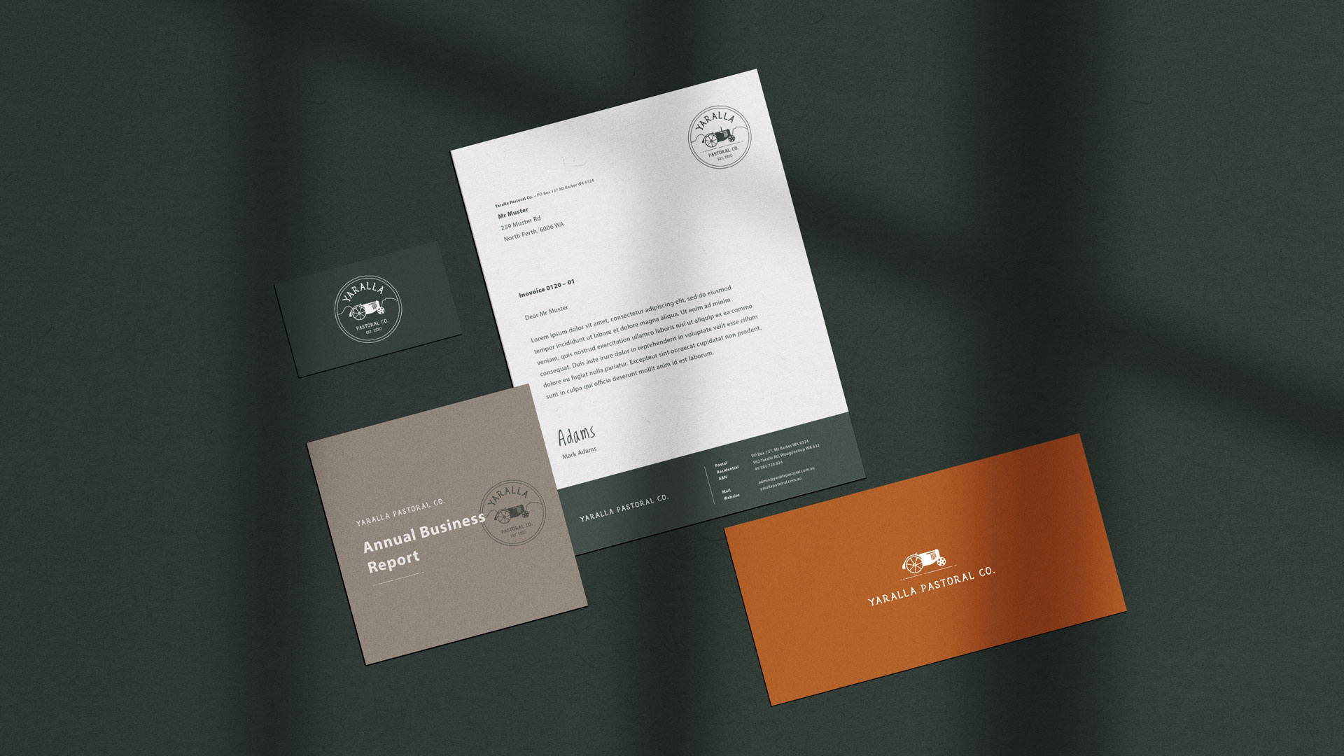
Flexible Logo
Yaralla Pastoral Co is a pretty long name, that’s why we decided to create a logo toolkit, which makes it easier for them to use the logo flexible in different formats. They either can have just the tractor or the tractor above or next to the name.