A holistic, natural and femininebrand identity for a Berlin basedMedical Yoga Studio.
SERVICES
Brand Identity
Website
CLIENT
Wannsee Praxis
wannseepraxis.
berlin
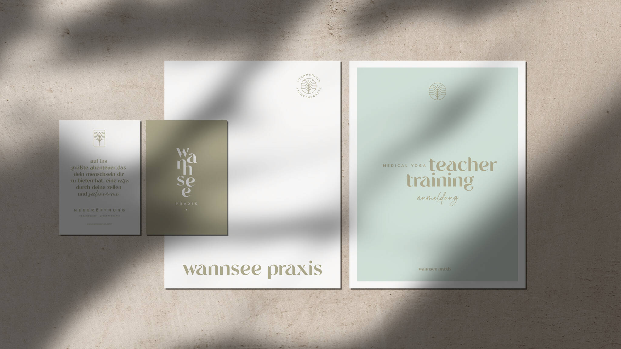
A natural balance between strength and lightness.
This brand identity is one thing above all: very special calming with a natural, but elegant vibe. We use gradients to emphasize the uniqueness of the medical yoga praxis, which is light therapy. It is all about connection and balance – the conceptual mix of medicine and yoga, strength and lightness. The whole branding lives through playful and naturally curved typography, and a color palette inspired by the change of the seasons.
Natural, earthy colors combined with bright gradients express fineness and dynamism. The geometric shapes of the logo ensure alignment & professionality, whereas hand-drawn illustrations & highlight fonts bring in authenticity & closeness.
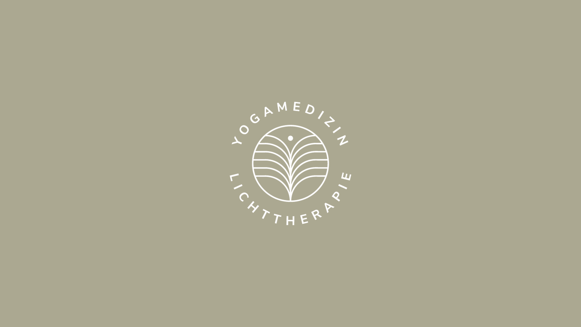
⸻ Flexible Logo