6 great Google Font combinations trending in 2020
When it comes to choosing fonts, you have to think of a font that is not only a good choice for your brand or your project, it’s also so important to choose a font that is a good design match. We love working with Google Fonts when it comes to a new branding since they are all open-source and 100% free for commercial use. This is perfect for a striking consistency within your brand. Let’s take a look at some of our current favourite font pairings.
Font pairing is all about balance.
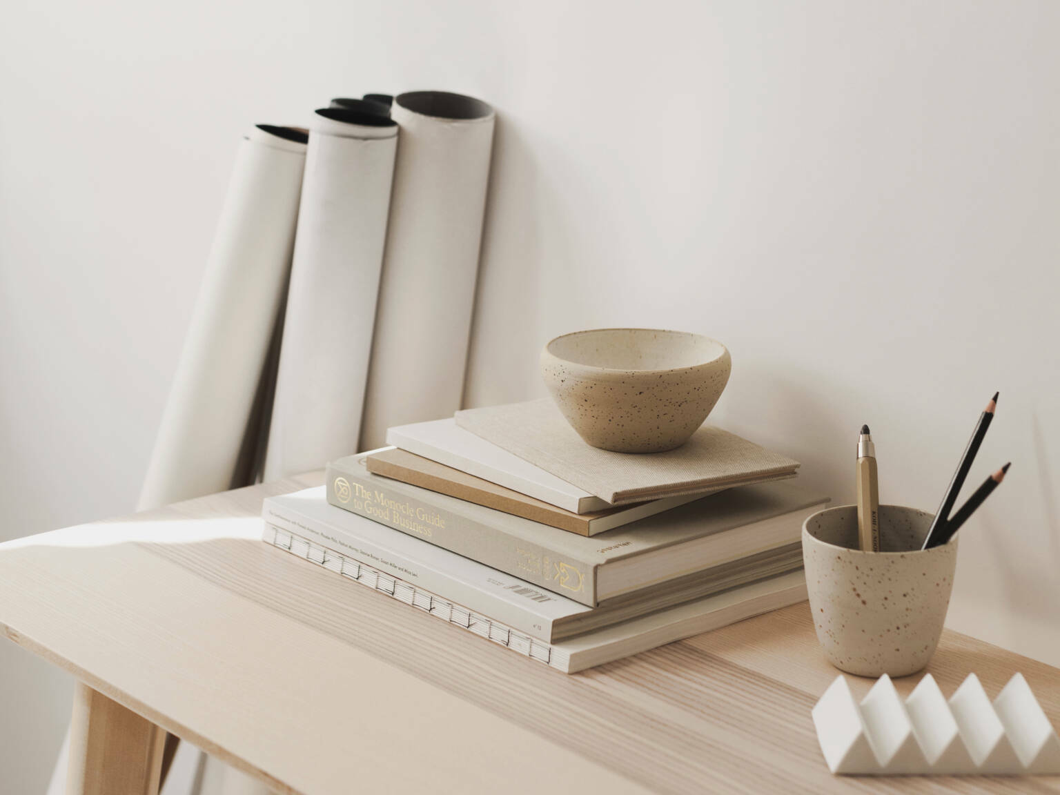
They are just as important as images or colors that shape an aesthetic.
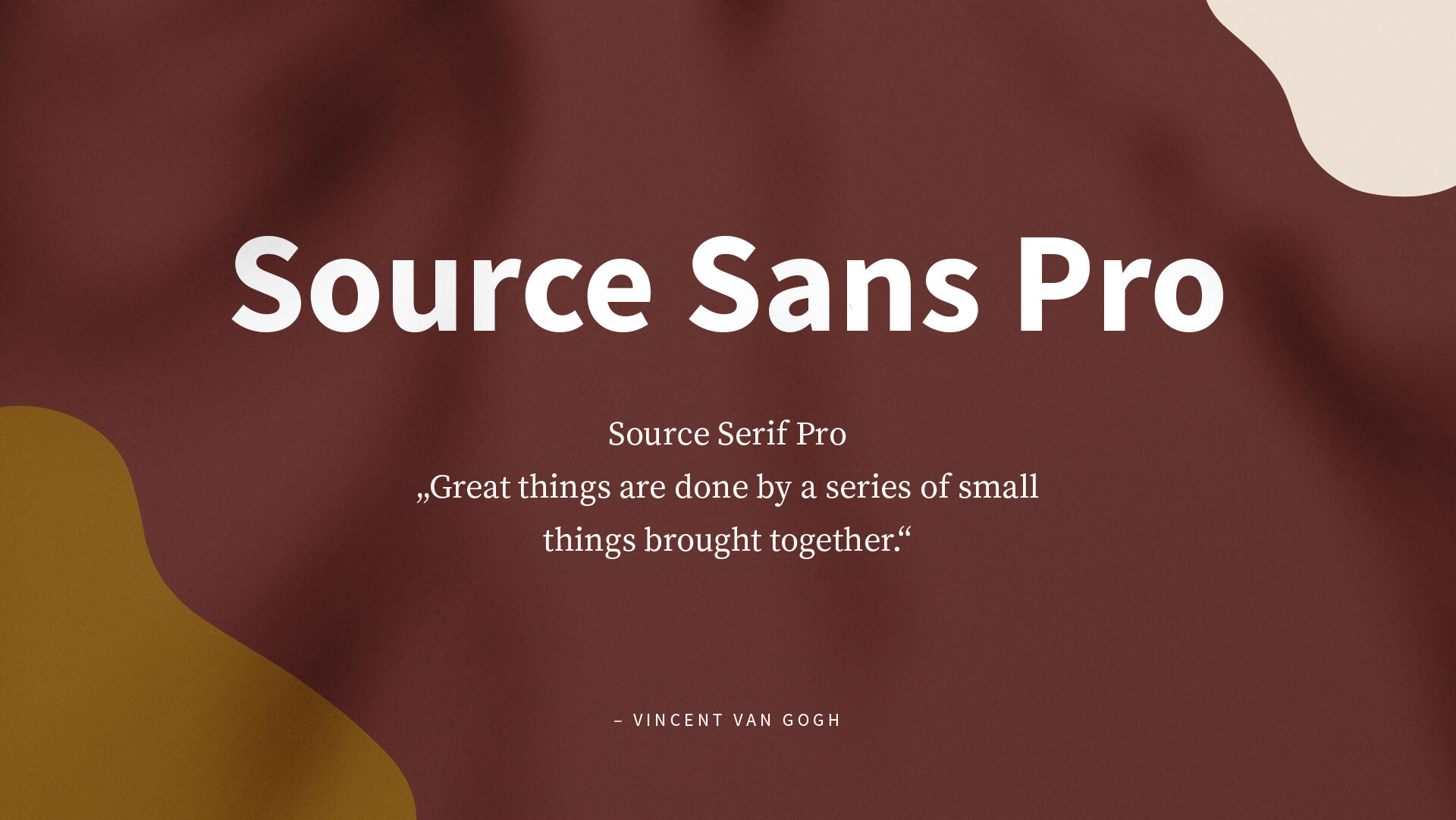
Source Sans Pro + Source Serif Pro
We try to avoid fonts with only a single-weight display face as they limit us in design. Luckily, the Source Sans Pro and Source Serif Pro come with plenty of faces which is great to stay flexible in our real-world projects. Source Sans Pro is Adobe’s first open-source typeface, designed by Paul D. Hunt, whereas Source Serif Pro was designed by Frank Grießhammer. We love using them as companions because of their beautiful match of letter proportions and simplified shapes which make them highly readable.
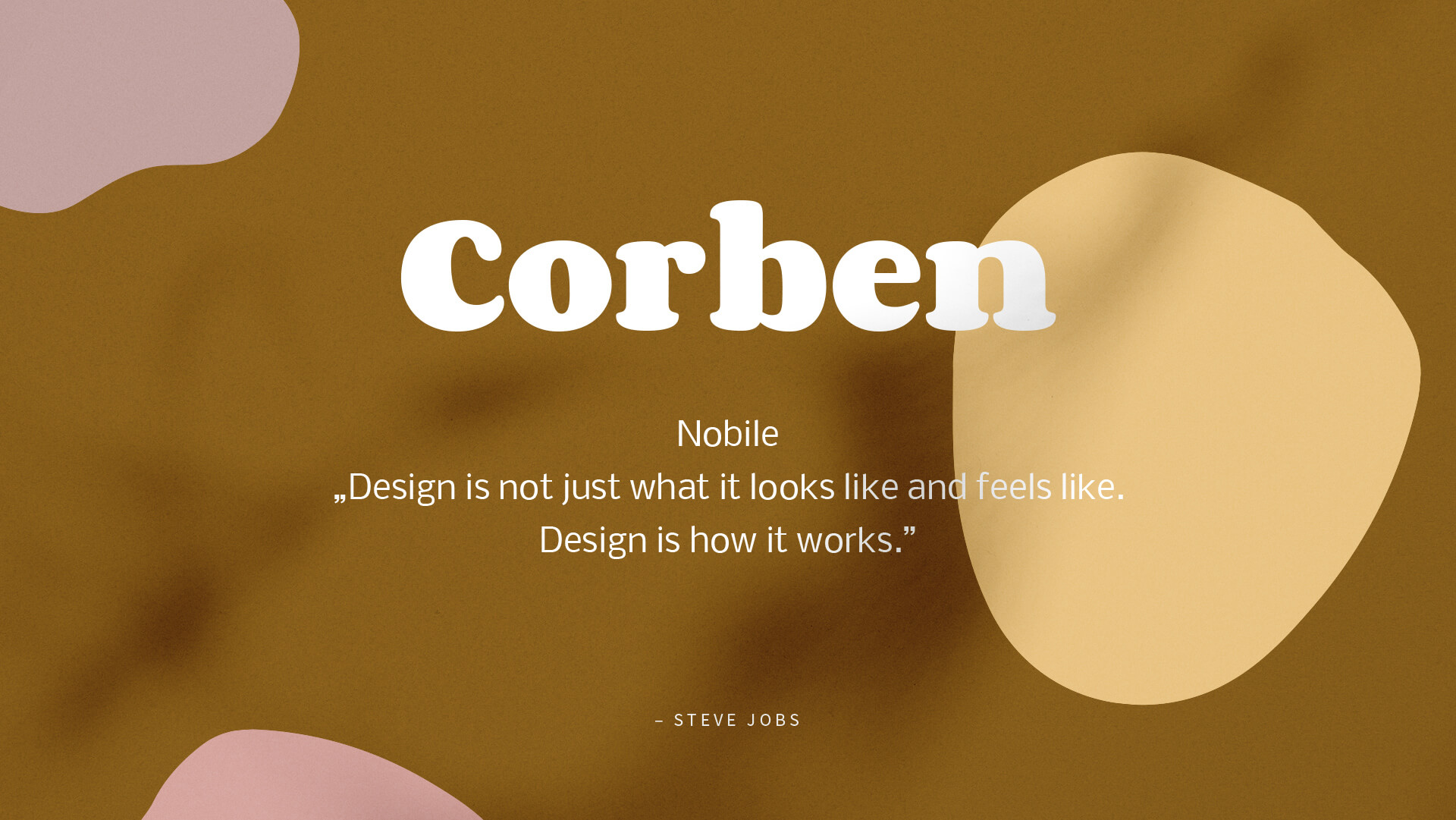
Corben + Nobile
One of the most popular ways to pair fonts is by combining a modern sans serif with a serif font. Combining Corbon with Nobile is a good choice, especially for screen environments since both fonts are designed for the work with new digital technologies. Corbon comes with a very simple, web-friendly style. The bold ample curves and ligatures make the font itself unique. Both fonts have a very distinct look. They function well – together and apart, and have great legibility on a screen. Oh, and they are good looking in any size of text, of course!
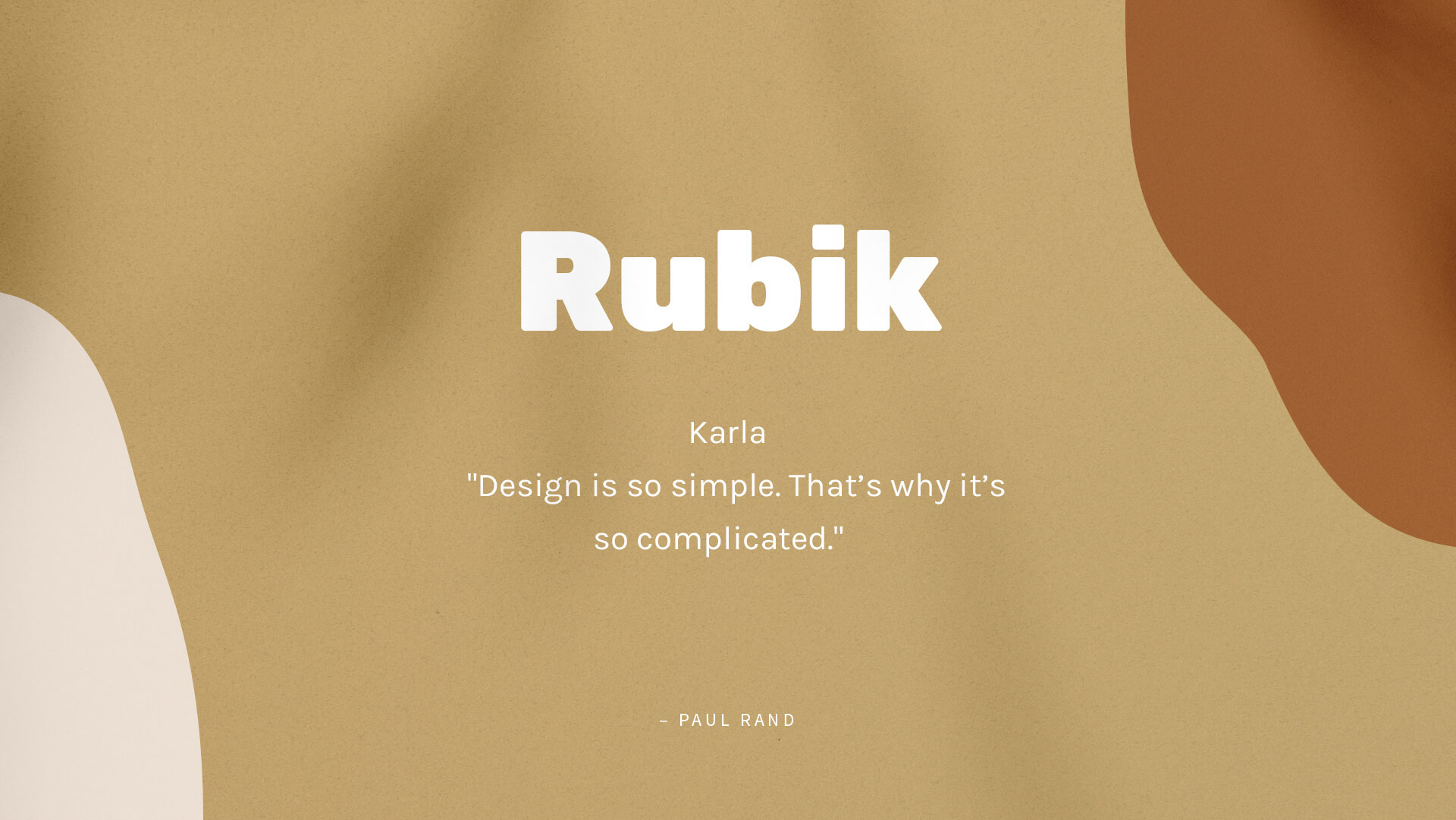
Rubik + Karla
Rubik is a sans serif font family coming with 5 weights, all open-source on Google Fonts. We especially love the combo of the bold style with the grotesque sans serif font named Karla. Rubik features stout proportions with low stroke contrast and slightly rounded corners. focusing on a very logical, constructed design. For copytext, we love pairing the font with Karla. A beautiful, more feminine typeface that perfectly balances the constructed feeling of Rubik in headlines with an imperfect touch within the copy.
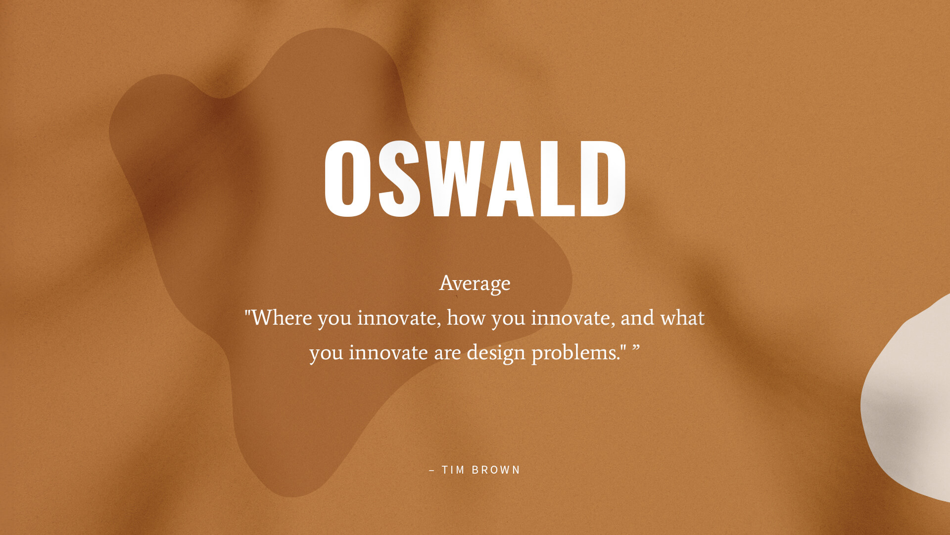
Oswald + Average
Oswald, as a classic gothic typeface has been reformed for better legibility and performance on digital screens. It’s available in light, normal and bold weights. Using the open-source font in its bold style and uppercase letters add a very modern touch to it. Sometimes, all a design needs is the right font combination to create something special. A good combo for Oswald is the contemporary serif font Average, which was developed based on a lot of research. The goal was, to create an actual ‘average’ font, it also comes with a sans companion called Average Sans.
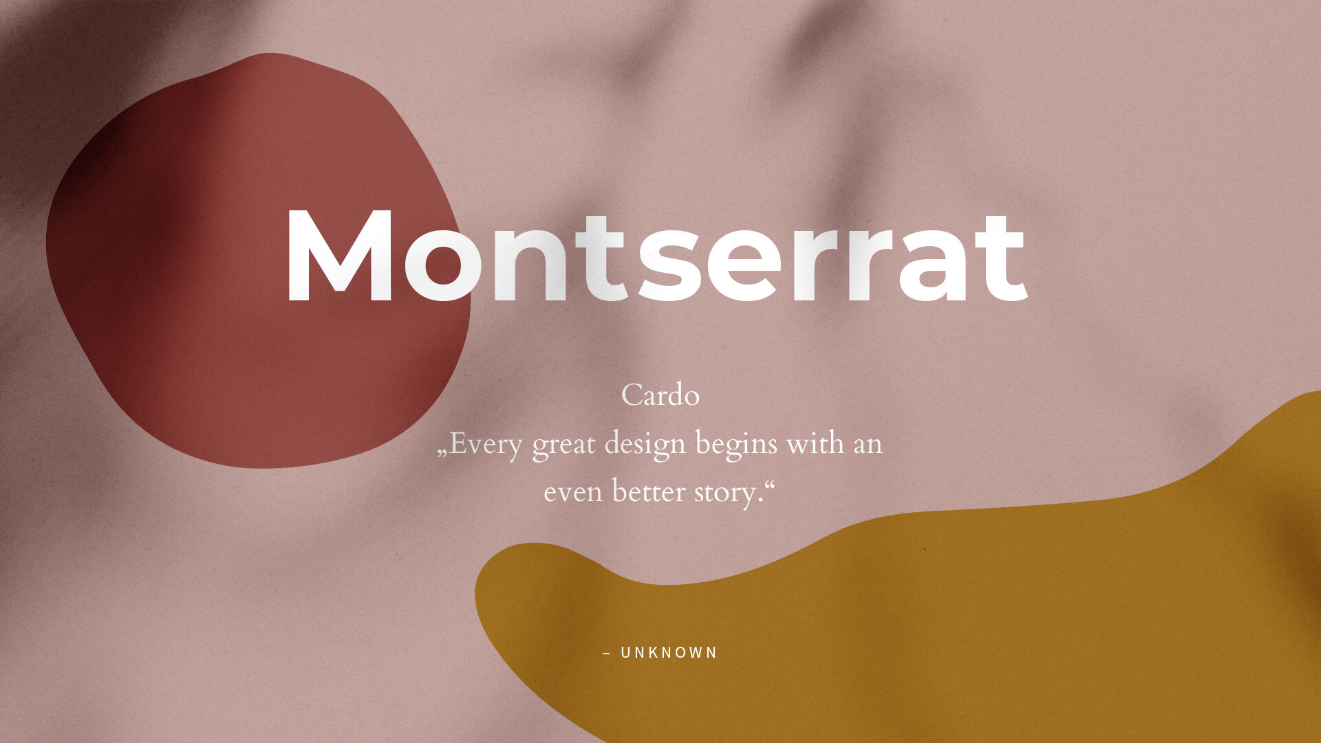
Montserrat + Cardo
Montserrat is an extremely popular, geometric sans-serif typeface. A very solid choice for anything creative, since it can be both the highlight of a design or the subtle, secondary font. It comes with 8 weights, which is amazing for any brand project. Montserrat is warm, approachable and filled with strength, a great foundation to be combined with Cardo, high-quality serif font in an amazing classic style. It adds a lot of variety such as ligatures or punctuation characters and is an appropriate combo partner. Truly, all of these elements combined amazingly impact any design.
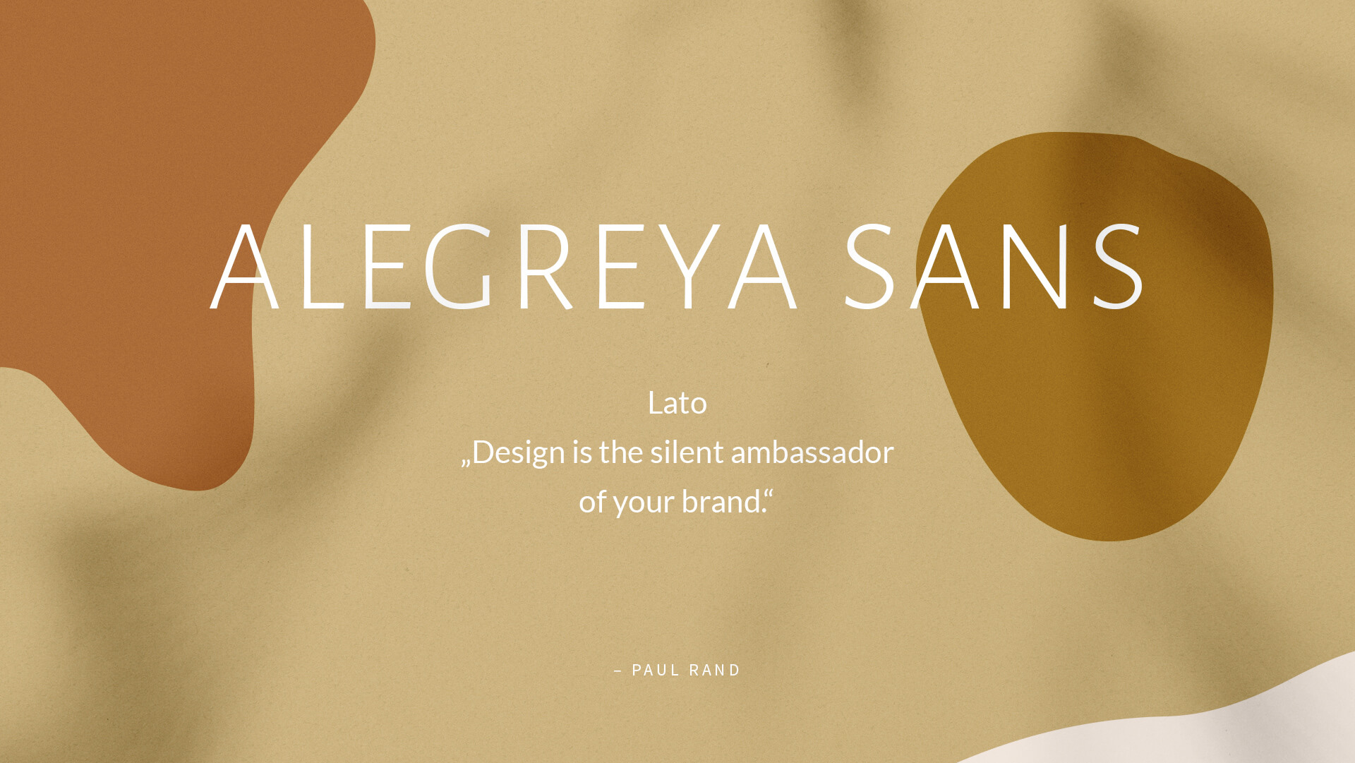
Alegreya Sans + Lato
Alegreya Sans is a very modern and dynamic typeface, with a rather classic character. It comes in plenty of weights and adds a very unique touch to designs, especially when used in headlines. Alegreya Sans follows natural principles and builds a great combination with ‘Lato’ – a very popular Google Font. Lato is a very honest and leek sans serif font with semi-rounded details. Both fonts provide a warm feeling and add a cohesive feel to designs.